Case Study
LR AllAssets
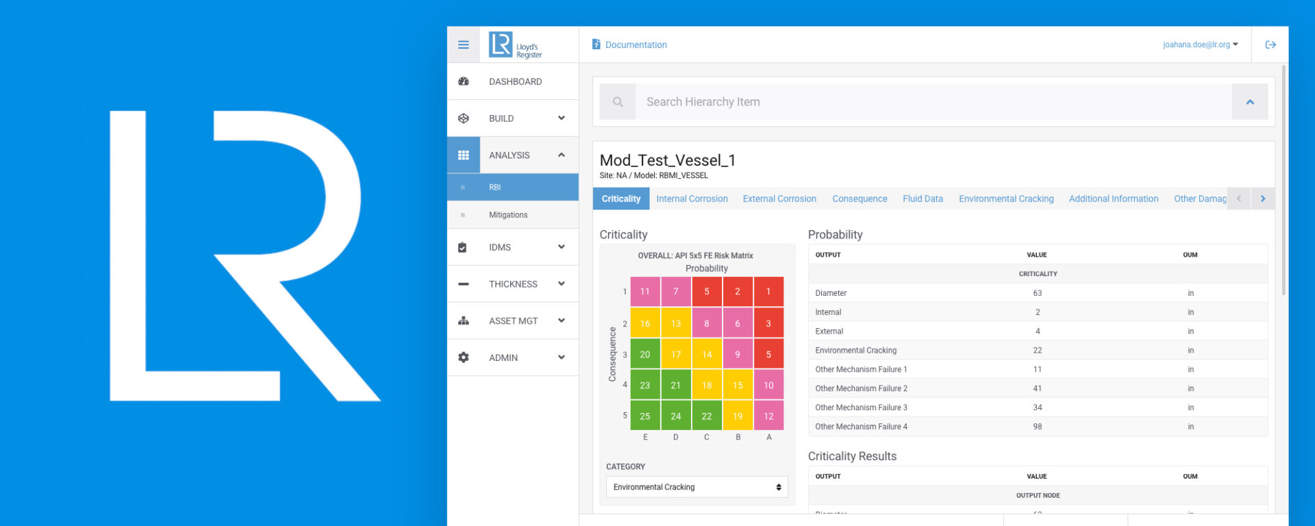
Lloyd's Register AllAssets is asset performance management software that helps users focus on critical equipment while optimizing inspection and maintenance. I redesigned the interface and implemented it in front-end code to reduce unplanned downtime and improve safety, equipment availability, and reliability.
Situation
Before this project, I worked for LR as a UI developer for several years. I knew their software, Arivu and RBMI, which had been rebuilt from the ground up as Lloyd's Register AllAssets. When they reached out, they needed help with UI design and front-end development because they knew my past work.
They wanted to focus on three pages: data uploads, mitigations, and the RBMI matrix. Each page gives end users tools to upload, assess, run analysis, and execute maintenance to extend asset life cycles. I put together a preliminary proposal and explained the UI principles that would improve return on investment by reducing training and support, increasing productivity, and protecting the integrity of the software. The manager approved the project with a $10k budget and a six-month window.
I performed analysis, updated the design, and implemented the changes in front-end source code. I collaborated with a UX researcher, developers, managers, and quality assurance across the UK and Houston offices.
Process
My approach was a three-step process. I analyzed the existing platform by understanding how it worked and identifying areas for improvement. I then created a design solution that addressed the problems and applied the new enhancements in the front-end source code.
Analysis
There were significant areas that impacted the way users perceived and processed information. The information and interfaces did not help or support human perception and cognitive load. The colors and patterns were inconsistent and provided no clear indicator of what action to perform. The information structure made it harder to distinguish one thing from another, lacking visual hierarchy and separation. Those are fundamental issues that hurt the overall experience of interacting with the platform.
One root cause sat underneath it all: the company had bought a template from CoreUI, and multiple developers had implemented proprietary algorithms, functionality, and features across all pages without standardizing the brand or visual elements.
Visual Elements
I highlighted the design elements that help users evaluate and process information quickly, without guessing or overloading their senses: lines, typography, shapes, form, color palette, and texture.
Design Principles
I applied principles that bridge software language and human interaction so users can understand and perform an action: unity, hierarchy, scale, Gestalt, balance, focus, space, contrast, and similarity.
Design
Below are the before and after results. The optimizations addressed how end users perceive and process information, with a clear hierarchy and indicators of what action to take.


Conclusion
From assessment to design and implementation, education and recommendations drove the outcome. The project focused on solving the user interface, interaction, and style guide, and keeping the end-user experience consistent and easy to use, with less emphasis on UX research. Design principles and visual aspects still played a role in user experience around input, process, and output.
I later learned Lloyd's Register had hired a UX researcher while the project was underway, but usability testing of the redesign was outside the contracted agreement. I completed the project on time, kept it under the $10k budget, and created a UI language that let LR evolve with users in mind.
Like what you see?
Let's talk