Case Study
UH Mobile Maps
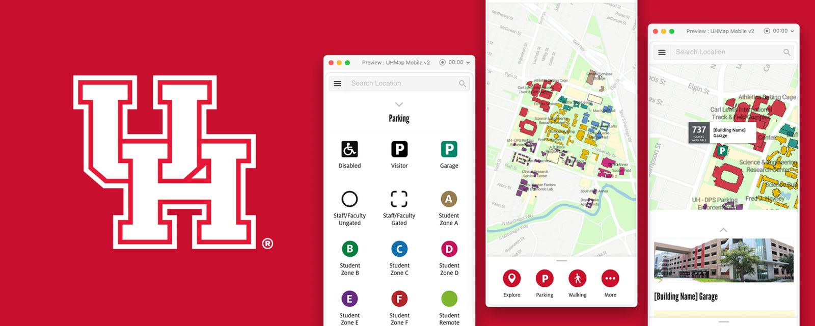
The University of Houston is a public university helping students pursue learning, discovery, leadership, and engagement. This project uncovered opportunities to display parking capacity, support multiple location services, and enhance the overall experience.
Situation
The UH maps used third-party software called MapBox, which gives developers the tools to build mapping, navigation, and search experiences within the UH campus. The map pairs MapBox mapping technology with the Bootstrap framework for its interface.
When I joined the team, the map had already been published without any user research into its usability or areas for improvement. My responsibility was to plan and perform user research to identify user objectives, assess UI issues, prototype, design, and validate through user testing.


Process
After I gathered the requirements and objectives, I followed this process to uncover issues and opportunities:
Assessment
I explored and navigated the maps to determine the questions to ask. I then talked with peers and users, asking about their existing experience with the maps.
Define the Problem
Once I synthesized their feedback and available data, I identified the issues that needed to be solved.
I determined 3 areas to focus on based on the requirements and assessment:
Ideation & Design
I explored solutions ranging from sketches to low- and high-fidelity screens. Design considerations included:


User Testing
I determined the metrics and number of participants and performed user tests to validate the potential solution.
Student Participants
Scenarios & Tasks
Test Results
I developed a usability testing strategy using an Adobe XD interactive prototype on desktop and laptop computers instead of mobile devices. There were no baseline metrics to compare against the existing UH maps, but we now had a data point to guide the course of action and compare future iterations.
Scenario 1
Goal: Locate options to eat on-campus
User Task: You want to find a place to eat on-campus, identify the options that are available.
Data:
Task Time: Average: 56.6s / High: 180s / Low: 9s
Pass: 80%
Difficulty rating: 1.8 (1 easy-5 hard)
Observation: One person commented that the word “Explore” was not something she associated with food.
Recommendation: Keep as is
Scenario 2
Goal: Find a list of parking garages on UH campus
User Task: You’re on the way to visit UH campus and need a place to park. Find a list of parking garages that you can choose from.
Data:
Task Time: Average: 19.8s / High: 45s / Low: 8s
Pass: 60%
Difficulty rating: 2 (1 easy-5 hard)
Observation: Color indicator related to district was a bit confusing. Users did not understand the purpose until they saw the connection to the building name. Two users interpreted the scenario and task differently, confusing visitor parking with garages.
Recommendation: Clarify the difference between Visitor parking and Garage since visitor can park in the garage.
Scenario 3
Goal: Identify the number of parking spaces available
User Task: Prior to getting to UH, you want to make sure there’s enough parking available in a garage. Identify the number of parking spaces available in a garage.
Data:
Task Time: Average: 11s / High: 20s / Low: 7s
Pass: 100%
Difficulty rating: 1 (1 easy-5 hard)
Observation: No major issue.
Recommendation: Keep as is.
Scenario 4
Goal: Identify the menu option that will let you share your location with a friend
User Task: You’re meeting a friend on campus. You have arrived and are currently parked in a garage, but your friend hasn’t arrived and is lost. Identify the menu option that will let you share your current location with your friend.
Data:
Task Time: Average: 44.4s / High: 84s / Low: 12s
Pass: 60%
Difficulty rating: 3.8 (1 easy-5 hard)
Observation: Everyone went to the “More” option and was looking to share from the list view rather than the detail page. Some users couldn’t find the geolocation button (menu covered it). One person noted the lack of a drag-and-drop pin to view and share a location.
Recommendation: Add the share in the More option and list page. Add the share & move geo button above the menu or below the search bar.
Scenario 5
Goal: Locate alternative modes of transportation available to you
User Task: You’re on UH campus and you need a way to get around other than walking. Locate information about different modes of transportation available to you.
Data:
Task Time: Average: 13.2s / High: 26s / Low: 8s
Pass: 100%
Difficulty rating: 1.8 (1 easy-5 hard)
Observation: One user commented that the “More” option is associated as a configuration or setting. One has identified the alternative transportation, but he was looking for shuttle transportation.
Recommendation: Add Shuttle in the alternative modes of transportation.
Conclusion
Ideally, establishing baseline metrics for the existing maps would have allowed a direct comparison with the new solution, but time and resources were limited.
Transportation methods and terminology were the main improvements needed based on feedback. During user testing, users frequently looked for a shuttle, geolocation buttons, pin-drop view, and share options. The terminology used was also a prominent issue to be re-evaluated. The "Explore" option was not something a user would associate with food, and the "More" button correlated as an additional configuration or setting.
My analysis provided a clear line of sight to gaps, which will help navigate future iterations, provide evidence based improvements, and formulate educated recommendations. I minimized assumptions by testing and focused on the end user's perspective. This process aimed to help make an informed decision on the next step: extend the UI/UX from the mobile to the desktop platform.
Like what you see?
Let's talk