Design system
Design
Every page on this site is built from the same small set of colors, type, and components. The goal is a site that feels simple yet thoughtful and deep. Hand written in HTML, CSS, and JavaScript, with no framework and no build step.
Logo
The mark pairs the L and D of Long Duong into one shape. It is the favicon, the header mark, and the footer signature across the site.
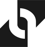

- Use the dark mark on light backgrounds, the white mark on dark ones.
- Keep clear space around the mark on all sides, at least half its height.
- Minimum size is 24px. It runs 30px in the header and footer, 54px in the hero.
- Do not recolor, stretch, outline, or add effects.
- The mark always links back to the homepage.
Colors
One palette, two themes. The theme follows the system setting by default, and the toggle in the header switches between auto, light, and dark. The choice is remembered on the device.
Light theme
Dark theme
Typography
Two families. Montserrat carries the display voice: headings, kickers, and labels. Lato carries the reading voice: body text and interface copy.
Heading 1 · Montserrat 600
Simple yet thoughtful
Heading 2 · Montserrat 600
Designer at heart
Kicker · Montserrat 700 · 0.28em tracking
Section label
Body · Lato · 18px · 1.7 line height
I lead with research, move fast with prototypes, and stay close to the build until every detail earns its place. Body copy runs at 18px with generous line height, set for long, comfortable reads.
Secondary · Lato · Muted
Notes, captions, and supporting text sit in Muted, a step quieter than the main voice.
Components
Live specimens, drawn with the same CSS the site runs on. What you see here is what ships.
Connect button
A pill with a 2px accent border. On hover it fills with accent and lifts 1px. It is the one call to action style on the site.
Icon buttons
46px circles with a 2px accent border. Same fill and lift behavior as the connect button.
Tag
Muted on purpose. A tag is a label, never a button, so it never wears the accent.
Form field
Underline fields, no boxes. The underline turns Accent Deep on focus.
Work card
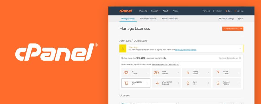
The whole card is the link. Full bleed thumbnail on top, title in Accent Deep, one quiet tag at the bottom.
Quote card
"I can not speak more highly of Long."
Stat card
Lift in store traffic after the cPanel Store redesign.
Lift in sales over the same period.
Callout
Simple yet thoughtful and deep.
A quiet band for the one line that matters most in a case study. Same border and radius as the cards.
Spacing and tokens
- Container
- 1160px
- Narrow container
- 820px
- Side padding
- 2rem
- Section padding
- 7rem, 4.5rem on small screens
- Card radius
- 14px
- Pill radius
- 999px
- Breakpoints
- 900px and 640px
- Focus
- 2px Accent Deep outline, 3px offset
Motion is gentle: sections fade in and rise 26px over 0.7s as they enter the screen, cards lift a few pixels on hover, and every animation turns off when the visitor prefers reduced motion. Behind it all, a fixed canvas draws a quiet geometric mesh with soft pulsing dots. External links open in a new tab and carry a small arrow, like this link to LinkedIn.
Principles
- Simple yet thoughtful and deep. If an element does not earn its place, it goes.
- Accessibility is part of the design, not a pass at the end: AA contrast, visible focus, reduced motion respected.
- Performance is a feature. Small pages, right sized images, no framework weight.
- One system everywhere. A new pattern gets used on a second page only after it is written down here.